Laura Mercier
Sophisticated and authentic, strategic brand storytelling & virtual try-on builds customer trust and cart-size.
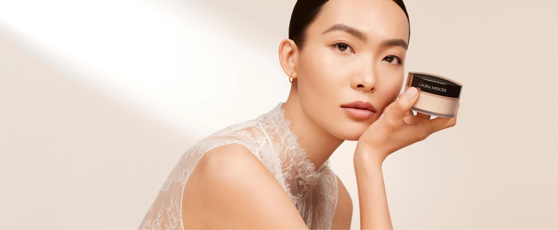
revolutionizing how to shop for makeup
Client
Laura Mercier
Year
2022
Role
Strategy, UX, Design
Platform
Shopify
Innovations
Multi-brand Module design system, virtual try-on integration, upgraded cart
Opportunity
While migrating from Salesforce to Shopify, Laura Mercier had a unique opportunity to infuse education and brand storytelling into their customer’s path to purchase. The look and feel of the new site needed the edginess of New York fused with the sophistication of Paris while touting the quality and authentic beauty of Laura Mercier.
Solution
The new site Guides the customer IN to product try-on and purchase using intuitive design, Trustworthy EDUCATIONAL content, and product storytelling that blends brand history and product benefits. Leveraging brand color and rich product Hues, the site effectively conveys Laura Mercier’s Complexion-first authority and creates a premium yet approachable path to purchase.
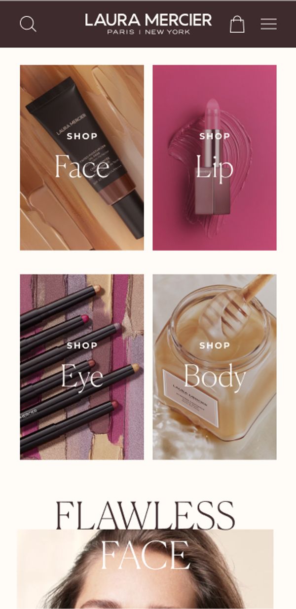
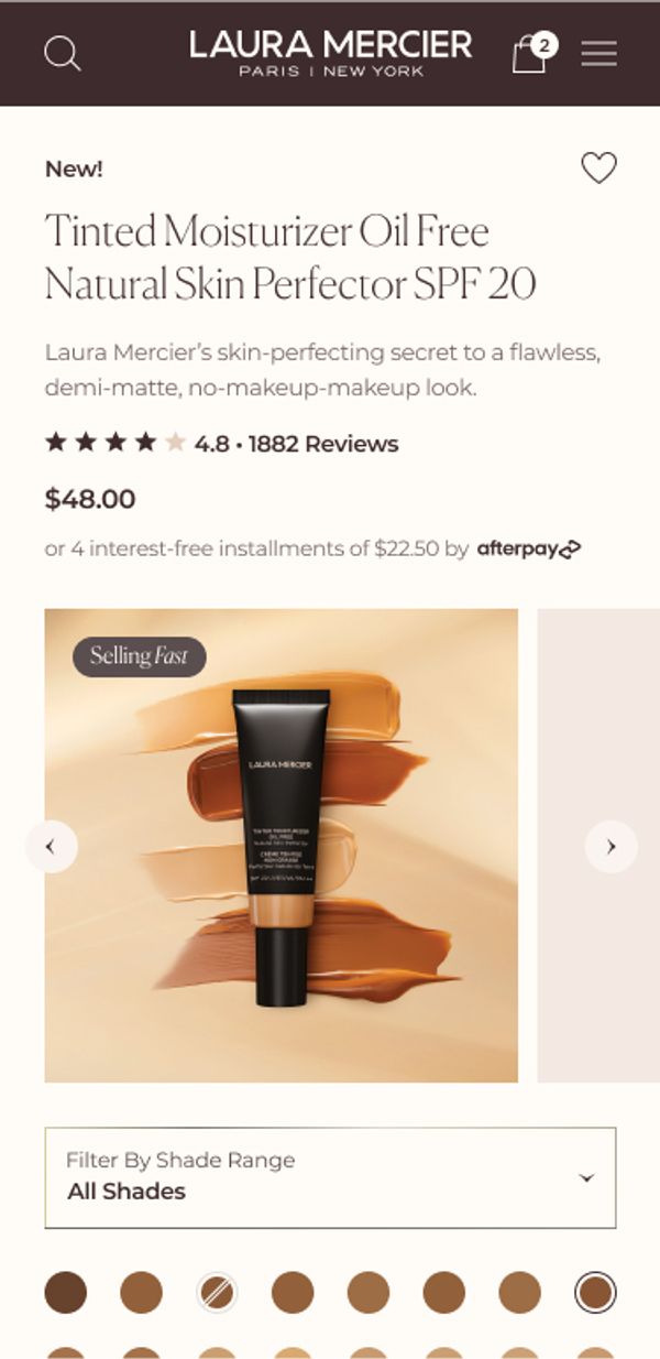
Effortless design inspires product discovery
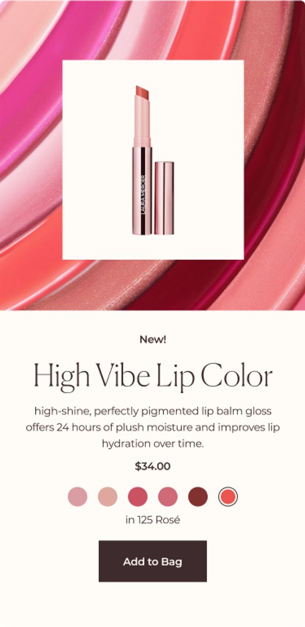
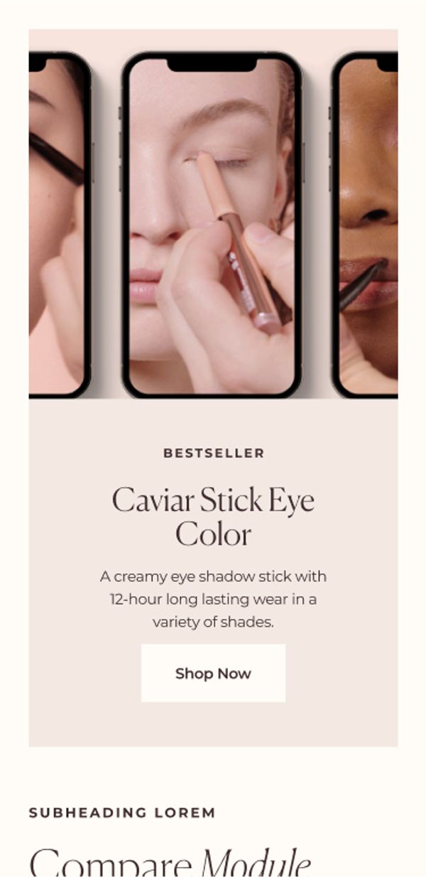
deliberate product and brand STORYTELLING welcomes a younger audience and inspires customers to discover the perfect assortment of products for their unique beauty routine.
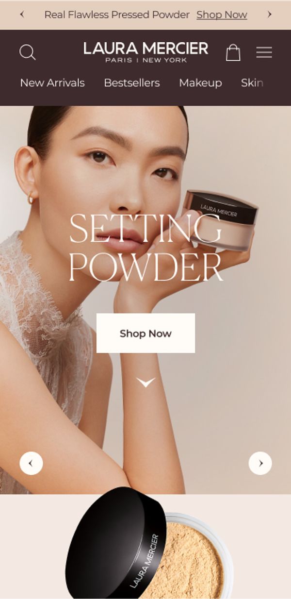
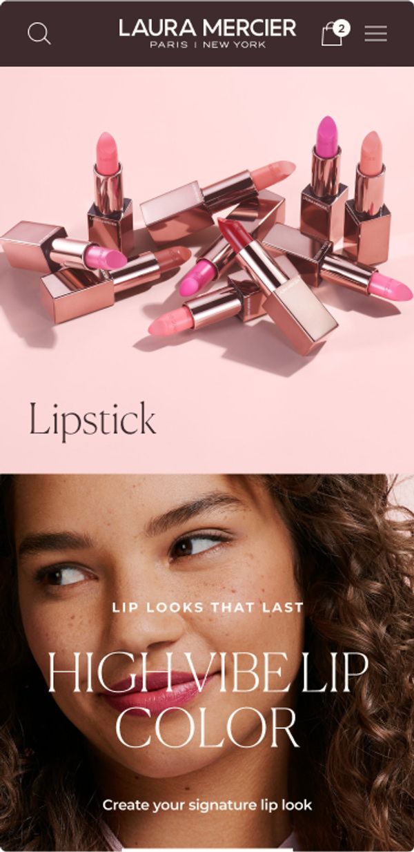
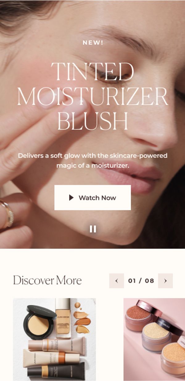
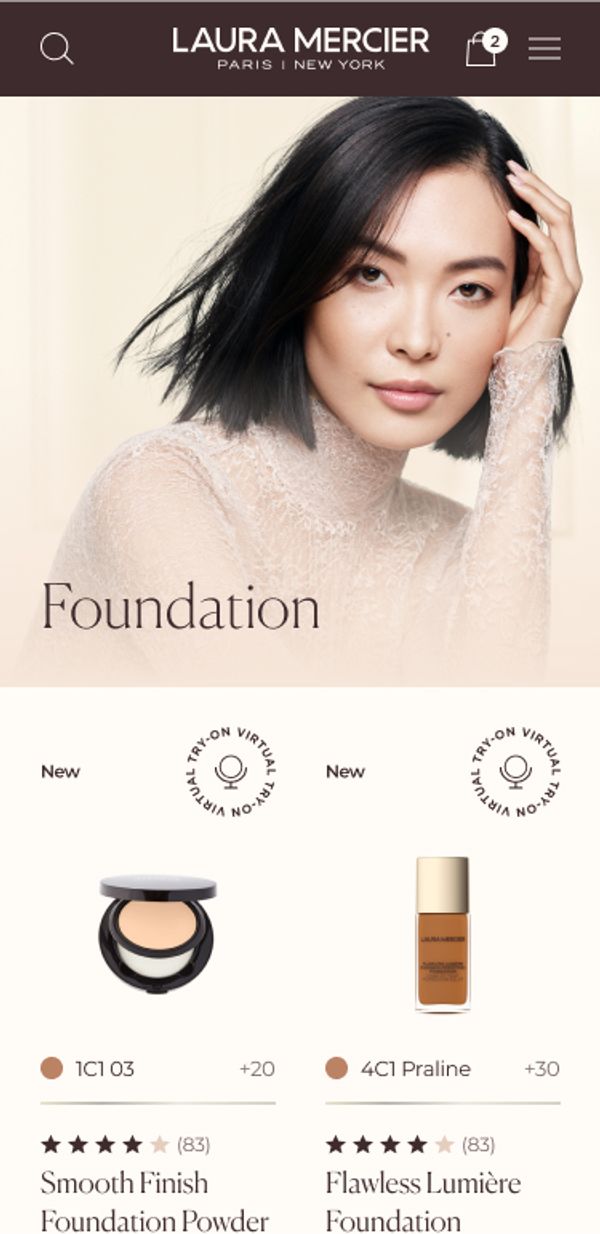
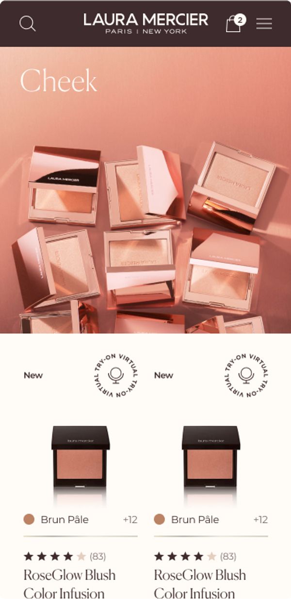
Virtual beauty to try before you buy
Laura Mercer's upgraded interactive beauty experience takes the guess work out of product selection and flawlessly guides customers to expand their laura product assortment from the comfort of their home.
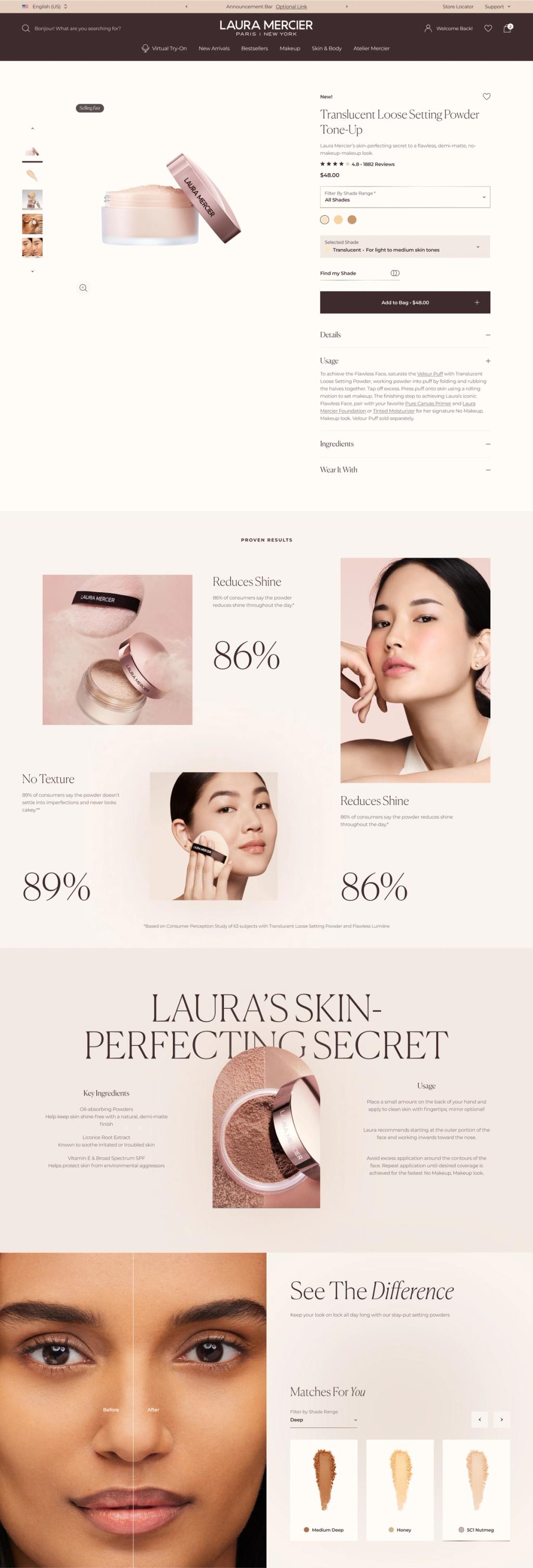
Elegance Meets Edge
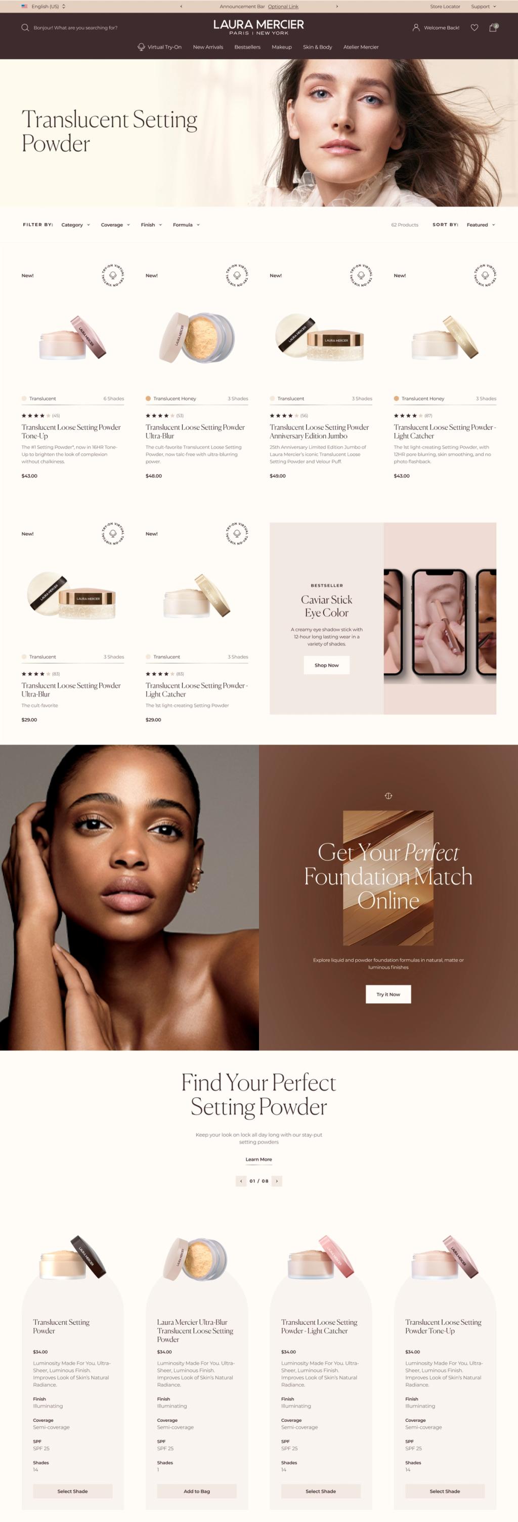
Effortlessly blending the edginess of New York with the sophistication of Paris
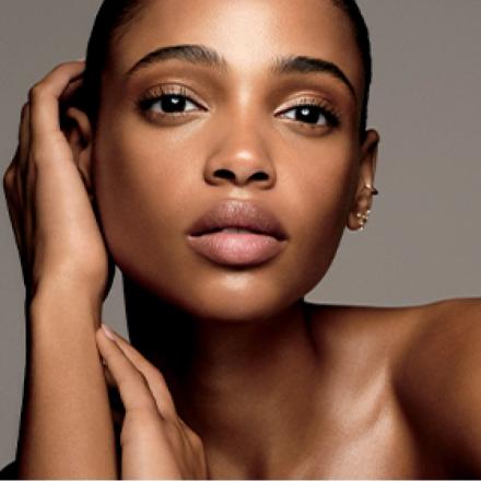
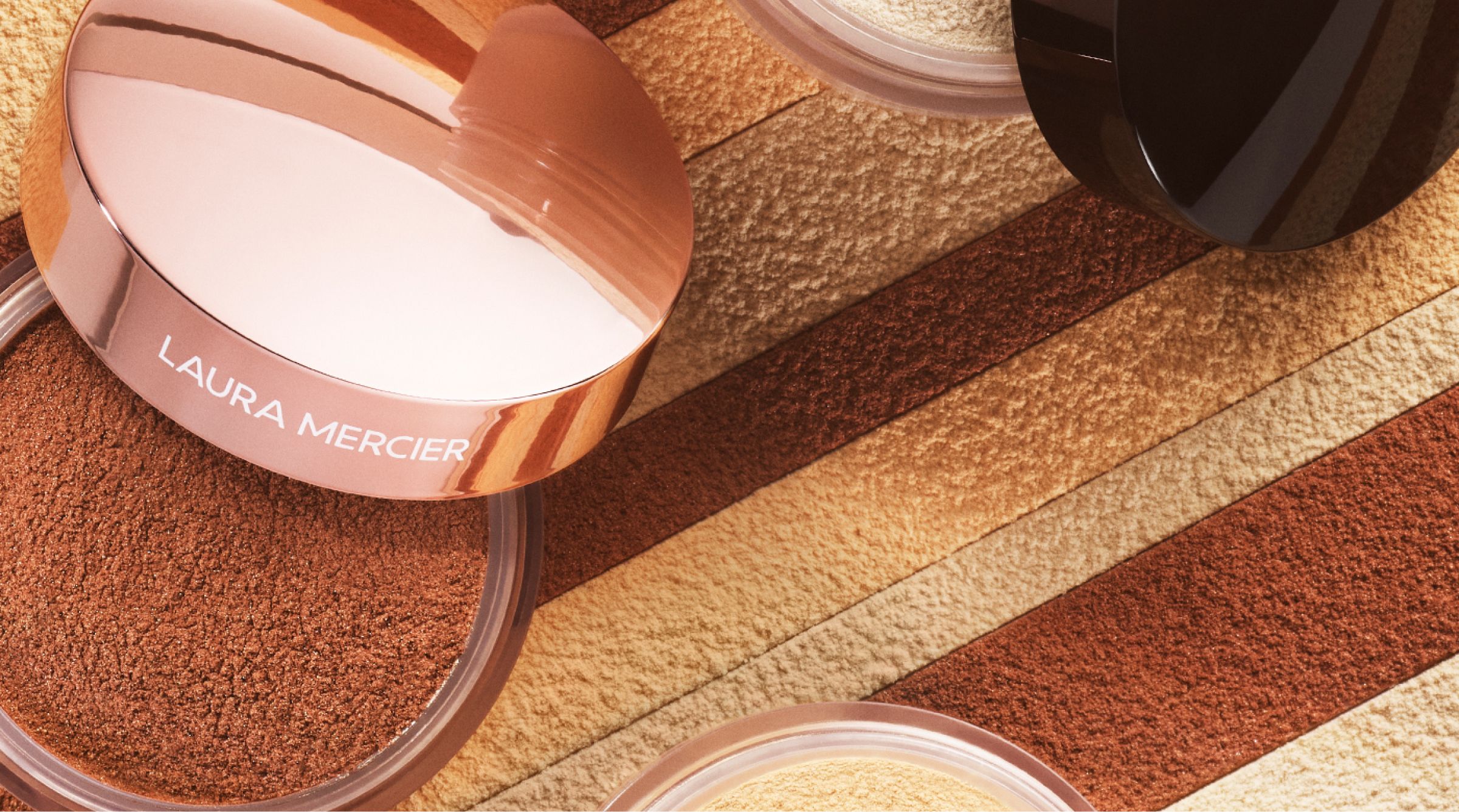

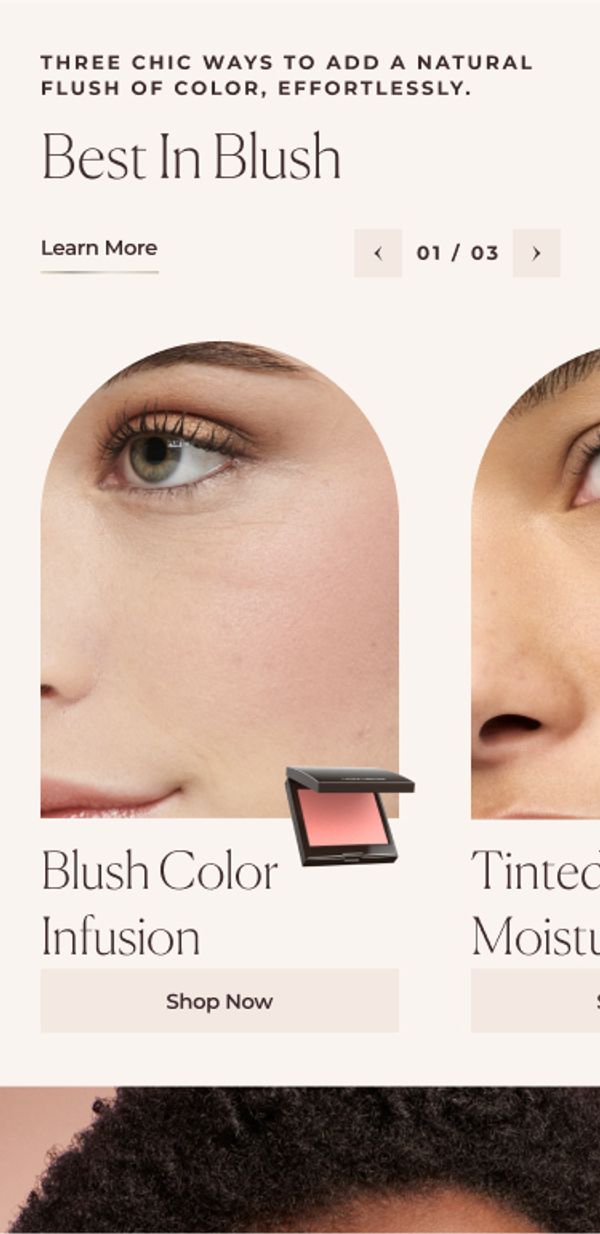
The site’s visual aesthetic aimed to reach a broader consumer base by blending the sophistication of paris & the edginess of new york. Nodding to their flagship locations, we included arches and line work elements, bridging digital with brick-and-mortar.
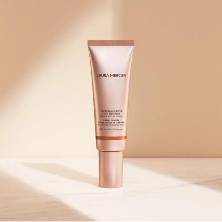
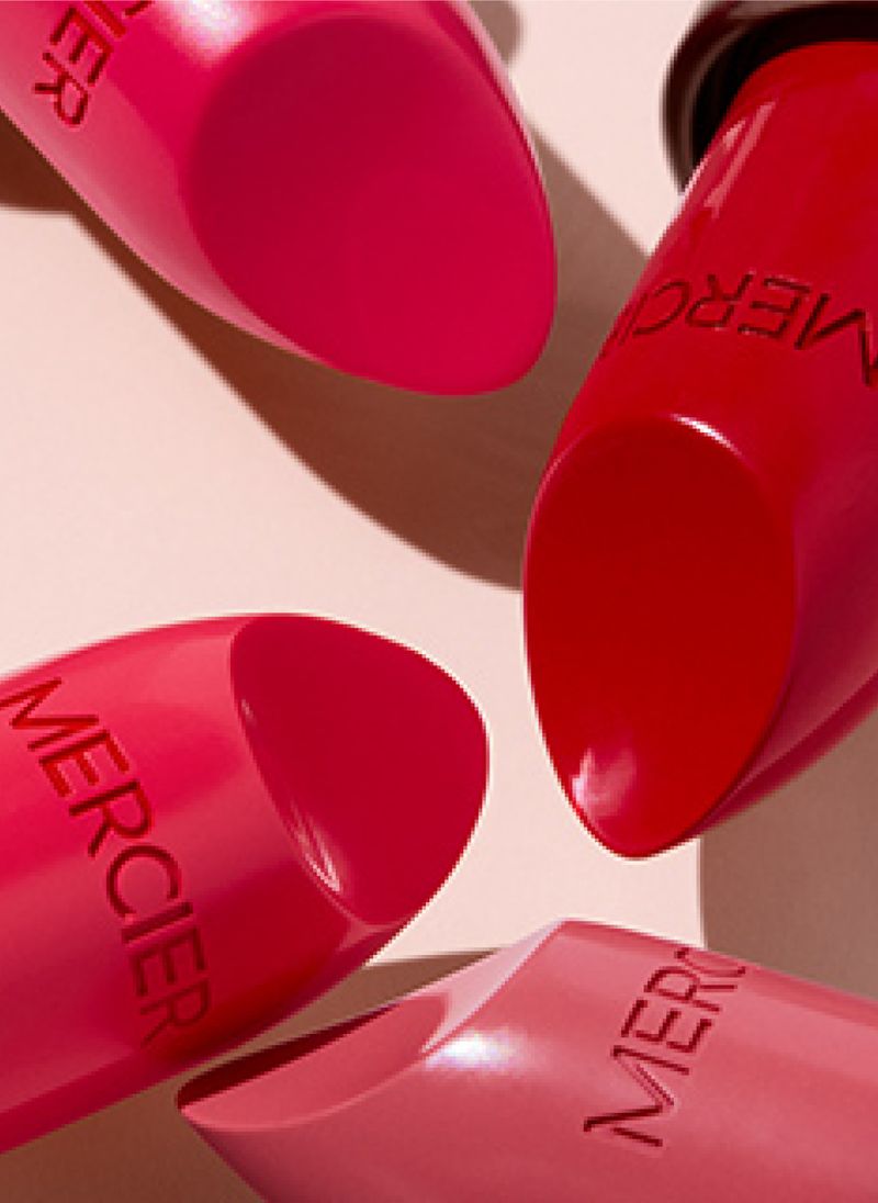
We maintained focus on the “Flawless face” products to continue to engage Laura Mercier loyalists. To add additional moments of color, we elevated lipstick and blush products along with Product swatches and rich product imagery that creates a youthful look and feel that guides customers to add new products to their routine.

“”
