Because sometimes “too much” isn’t enough
Client
BUXOM COSMETICS
Year
2023
Role
Strategy, Brand Refresh, UX + UI
PLATFORM
Shopify Plus
INDUSTRY
Beauty
PARTNER
Half Helix
OPPORTUNITY
Buxom Cosmetics is a bold, sexy brand built on giving its fans more to choose from. The challenge: how to serve up all the available options in a shoppable experience.
SOLUTION
Design a Shopify Plus website that focuses on discovery commerce and social integration, optimized for pure performance.
Adding sizzle to a successful relationship
After our successful redesigns for bareMinerals and Laura Mercier, Orveon asked us to tackle a third brand in their portfolio – Buxom. While we would be able to leverage previously created templates, we’d also have to solve for a new challenge unique to this bold, over-the-top brand.
Look at all the pretty colors
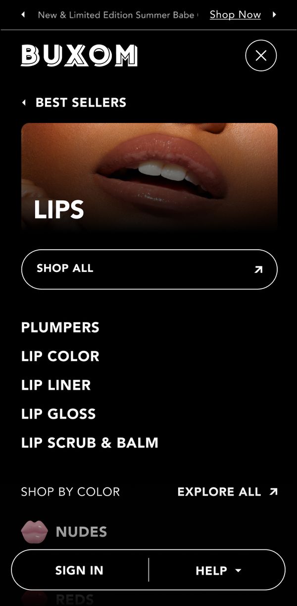
Buxom is all about giving its customers “more” – more shine, more fullness, more choices. As a #1 leader in lip gloss, some of its products come in 60+ color options. We needed to present those many options in a shoppable experience without it being overwhelming or dropping performance.
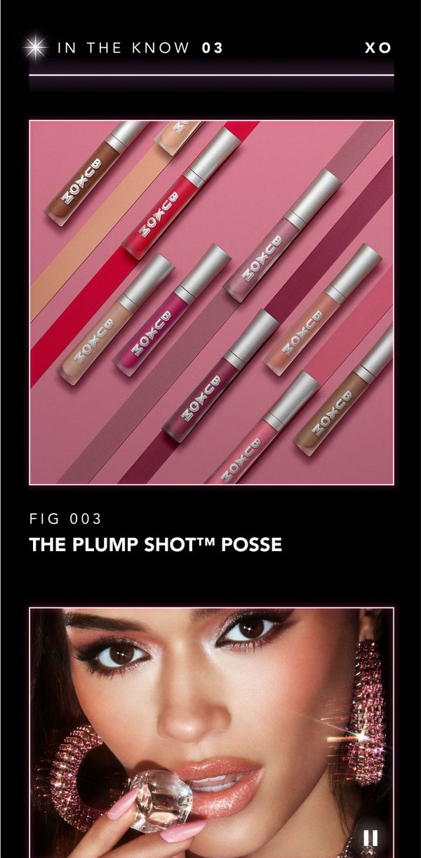
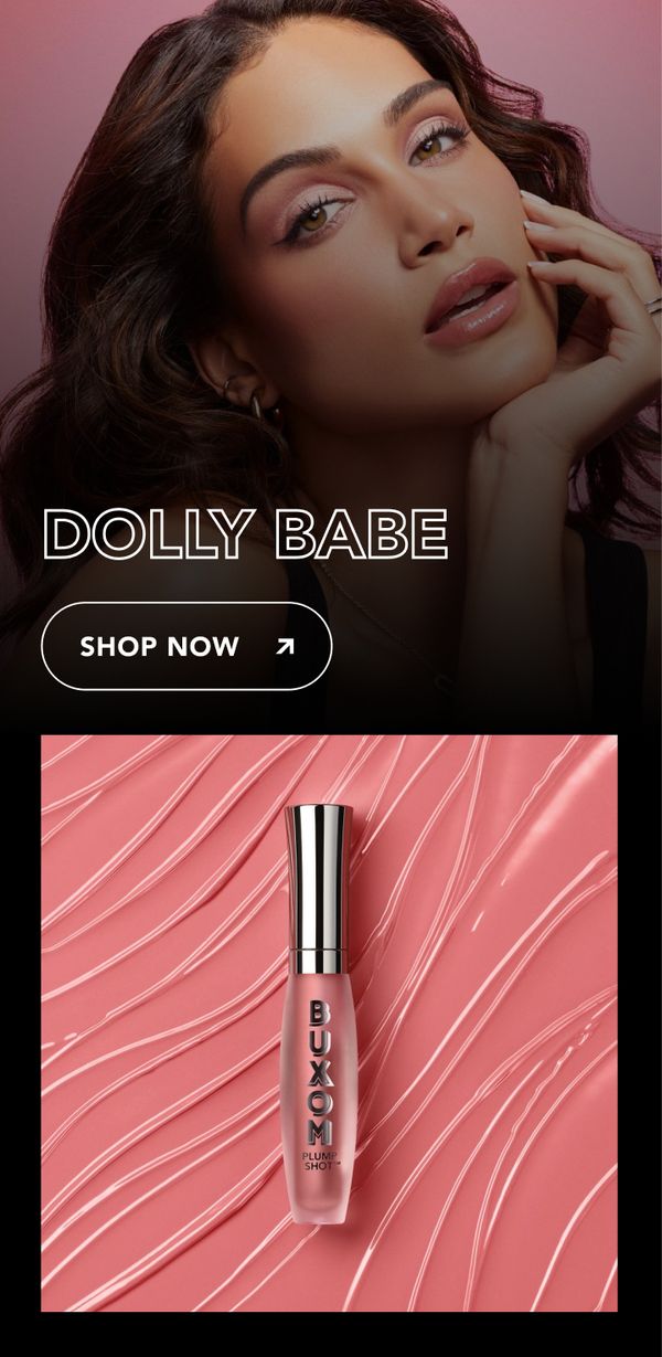
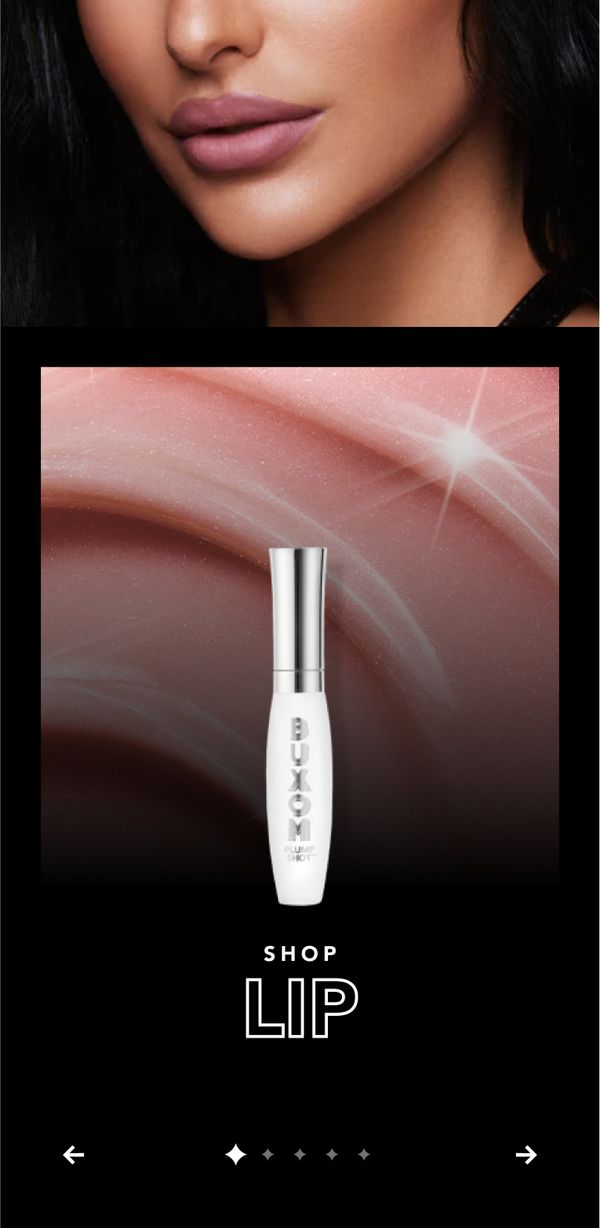
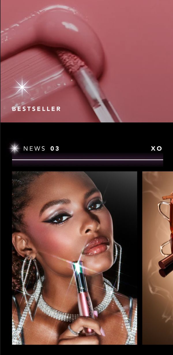
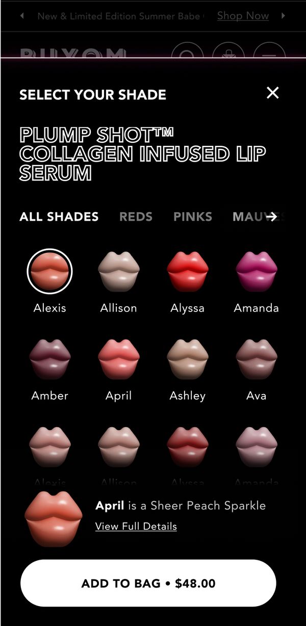
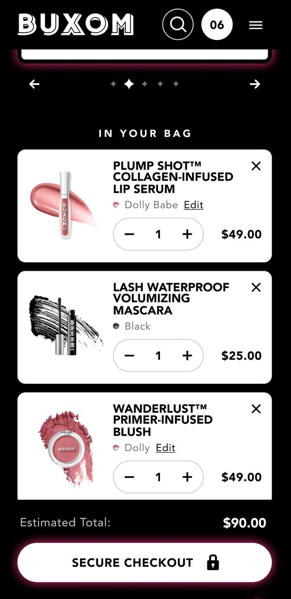
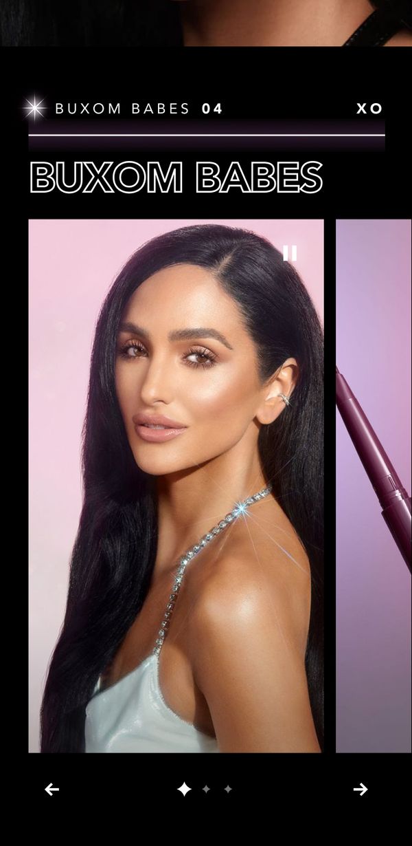
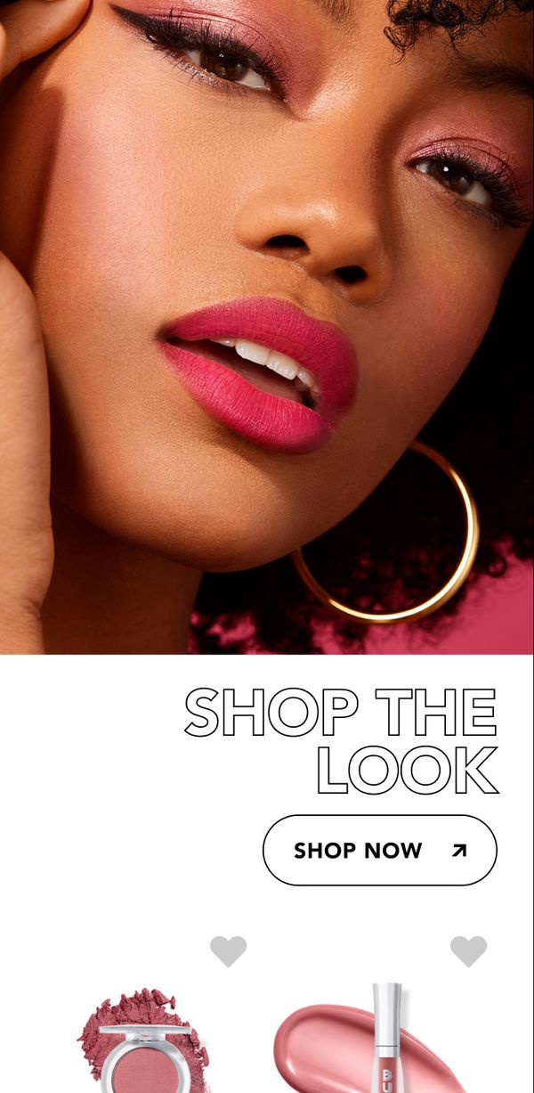
Overwhelming in a good way
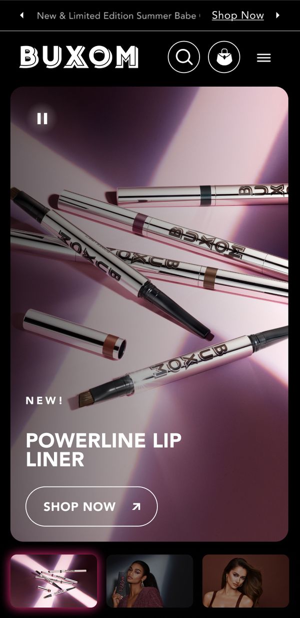
How did we do it? We could say “our lips are sealed” – but the truth is it took some creative tech and design wizardry to meet the challenge. Beyond the color choices, our site redesign also featured heavy social integration and video tutorials to create an entertaining experience geared at Buxom’s target audience of 18- to 25-year olds.
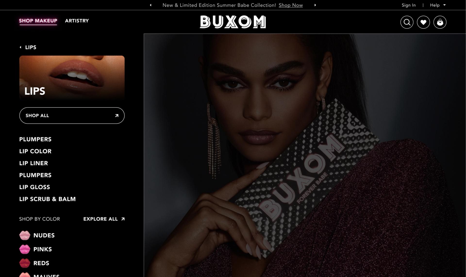
A site to behold
Get close to these design touches
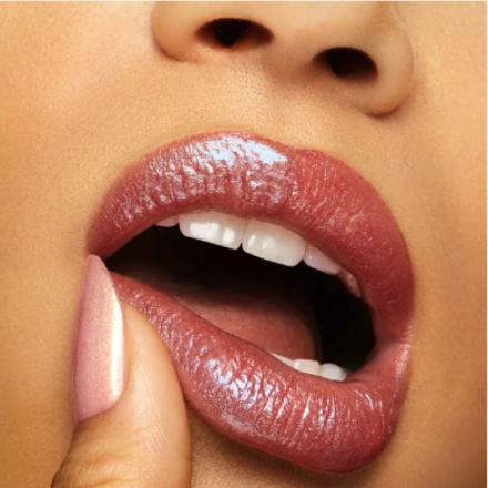
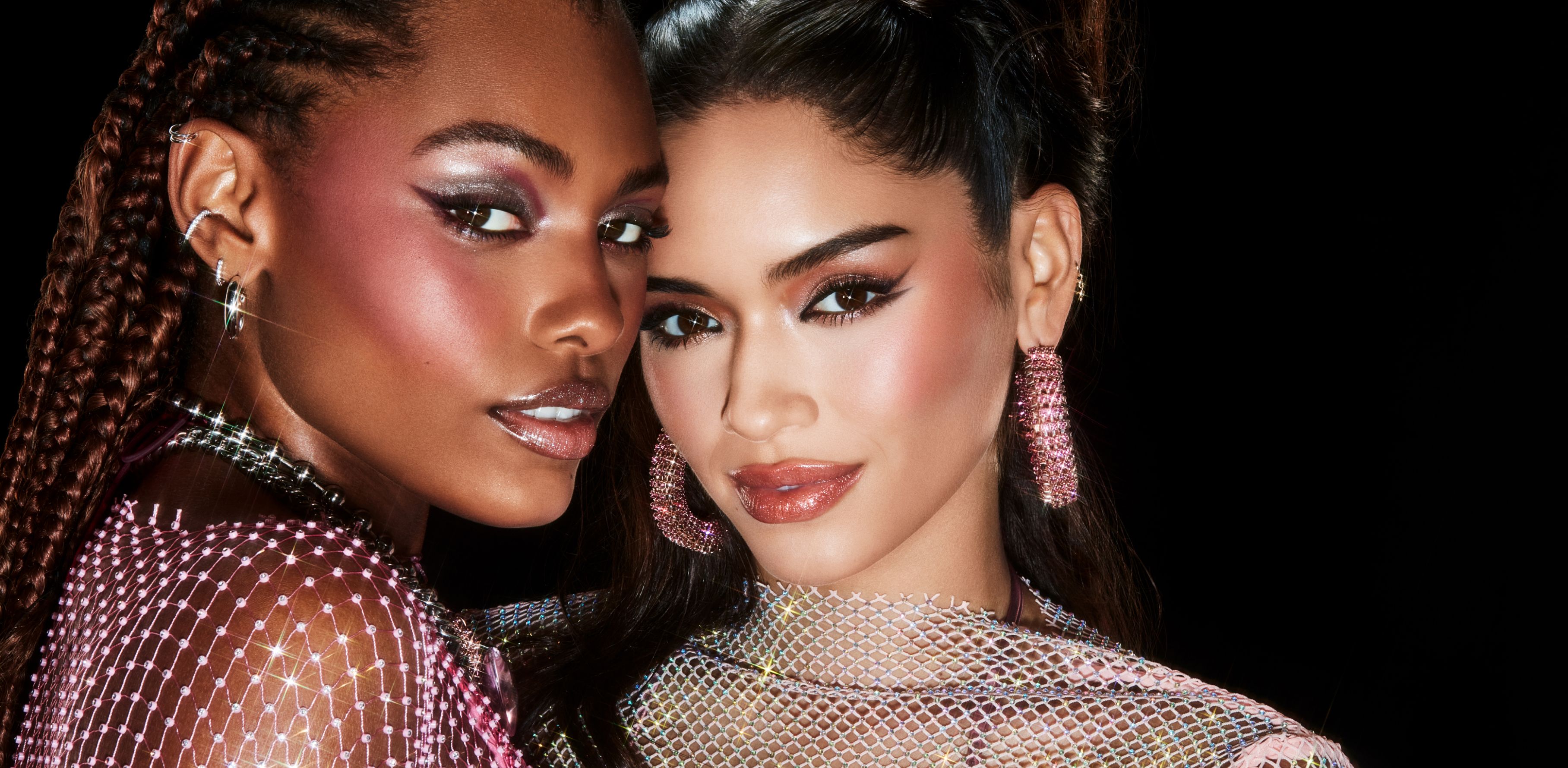

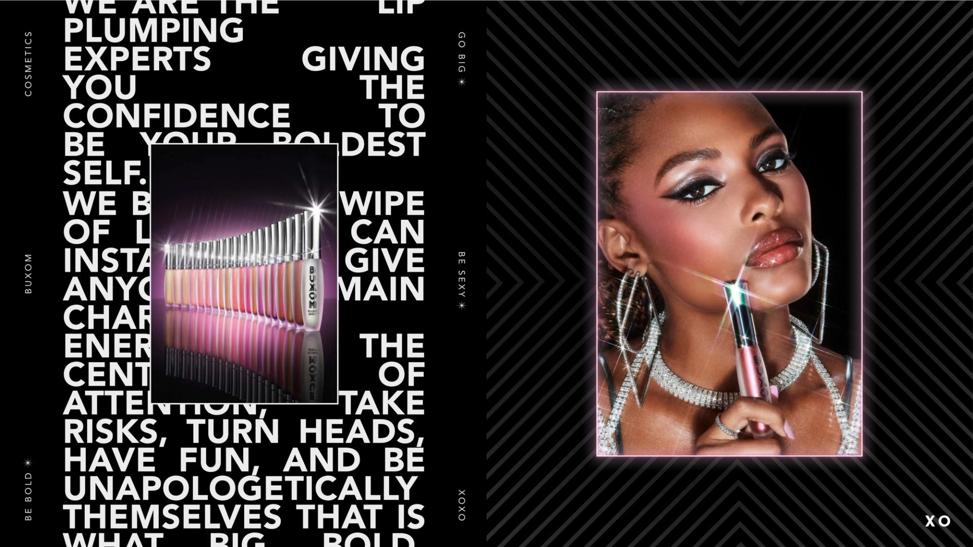
Celebratory high-contrast colors and bold, brash typography were chosen in keeping with the Buxom brand aesthetic.
The end result – big, bold, sexy, feminine, and not afraid to show it.
