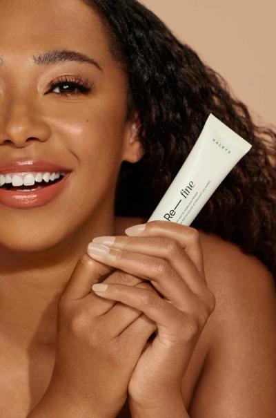
HALEYS
An optimized shopping environment with science-backed ingredients at the forefront. Driven by visuals, motion, and cohesive brand elements.
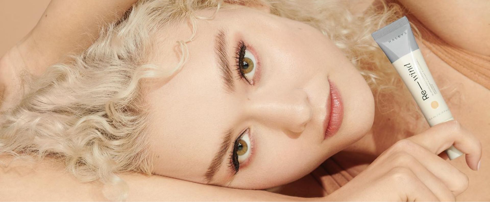
A beauty brand that's more than skin deep
Year
2021
Role
STRATEGY, UX, DESIGN
Ask
A direct-to-consumer site that emphasized the science-backed approach to their products.
Solution
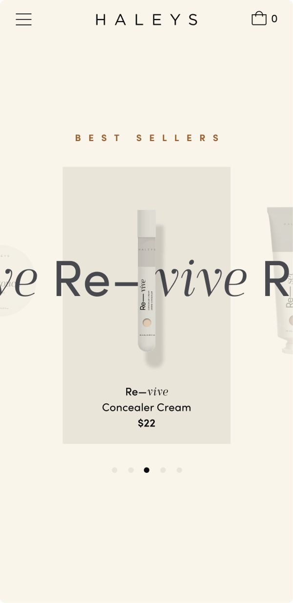
We crafted a product-focused commerce experience that promotes the brand's smart beauty approach, driven by highly branded interactivity.
Founded by chemist Ashley Ocampo, HALEYS reimagines makeup with scientific and environmentally-conscious ingredients. By creating an experience that focuses primarily on the product, we were able to evolve the brand's visual language into a digital environment. Combined with a strong UX foundation, we were able to create an intuitive experience that makes for effortless shopping.
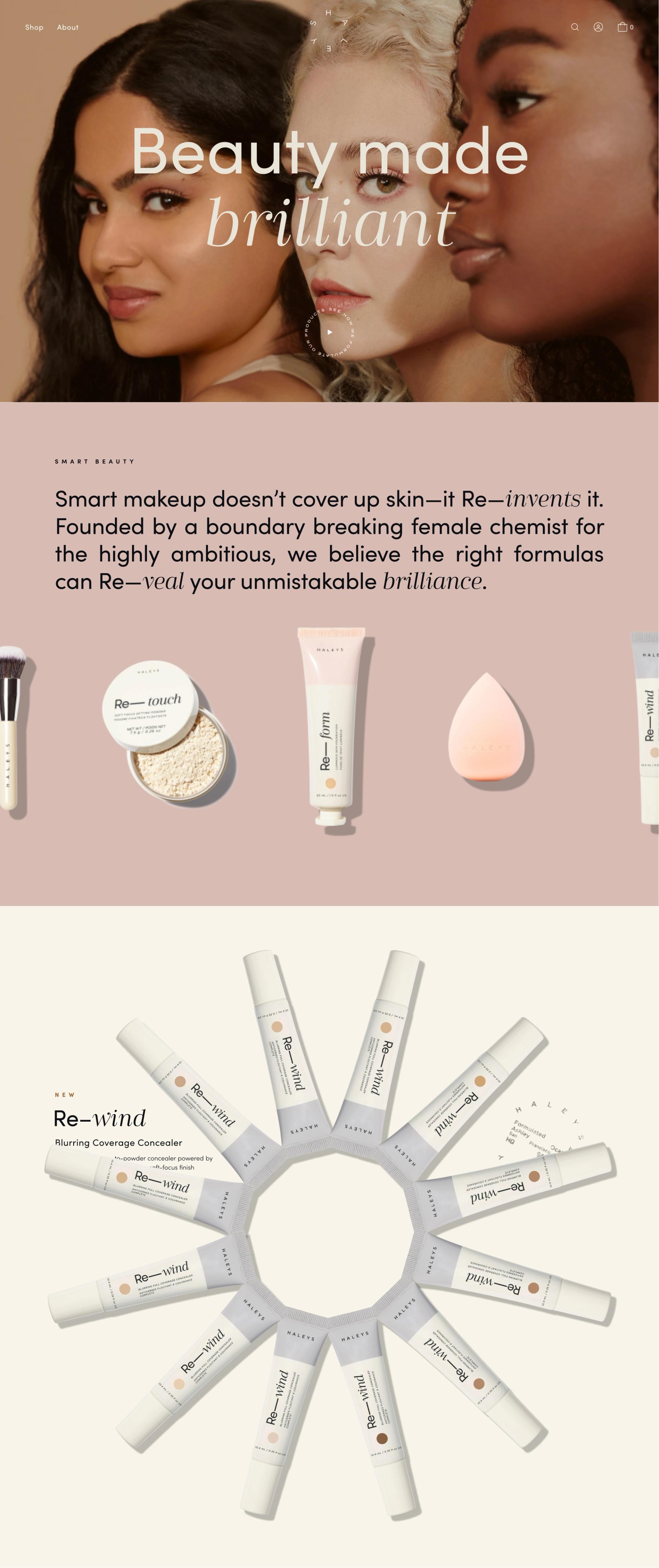
Formulated Style
A science-led digital brand language.
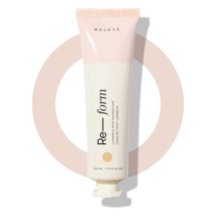
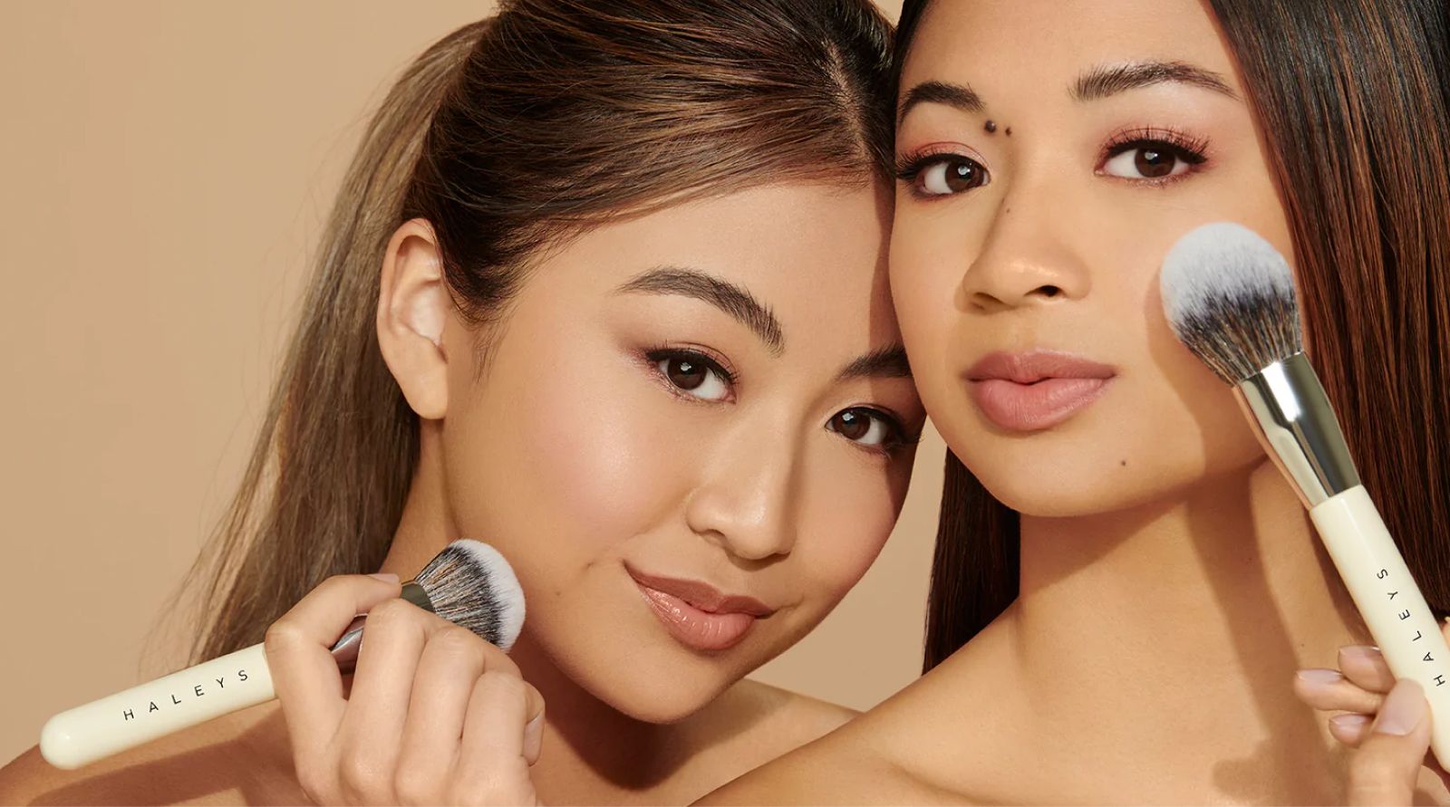
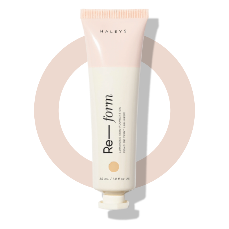
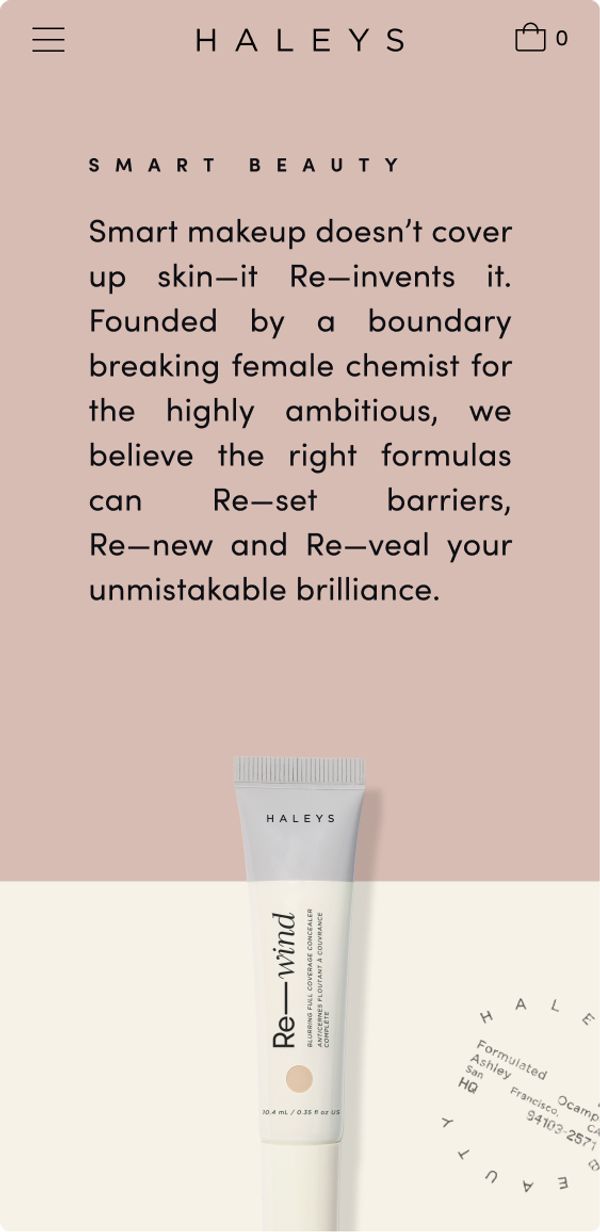
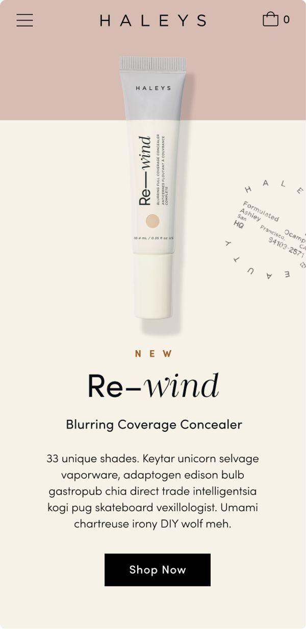
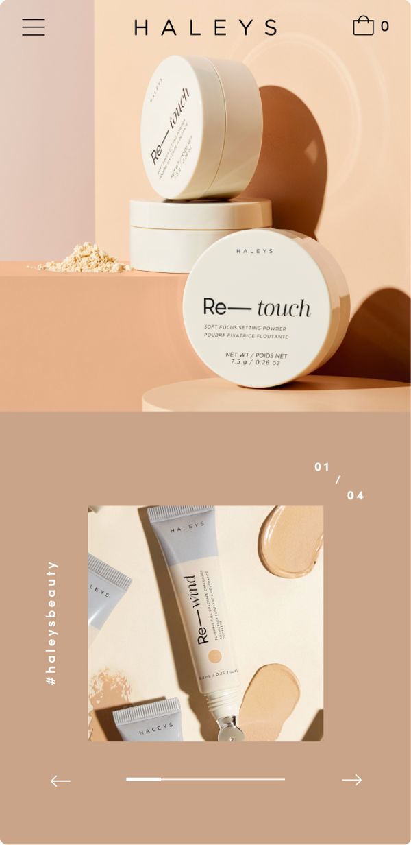
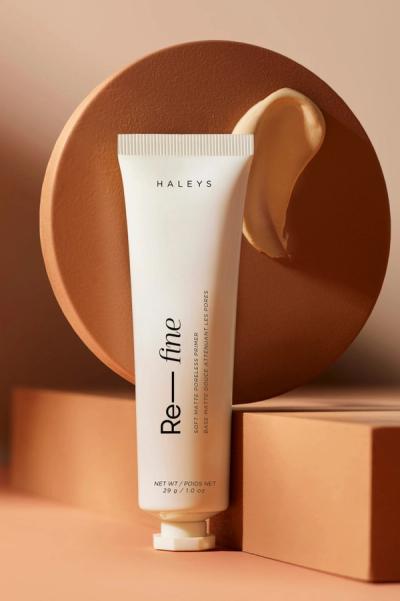
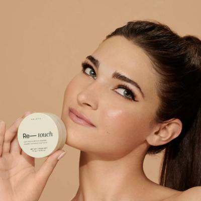
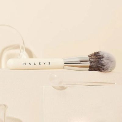
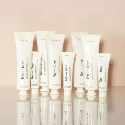
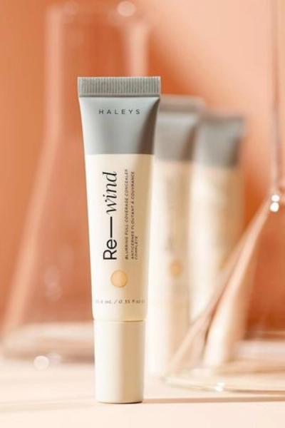
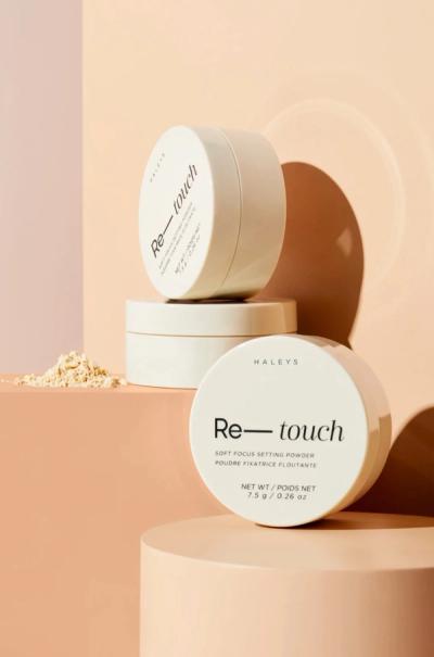
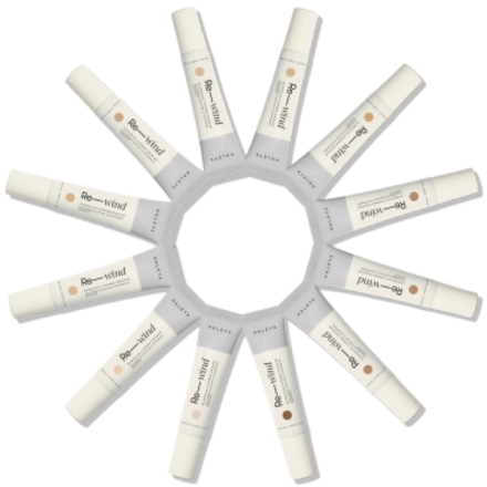
Taking inspiration from HALEYS updated product packaging, we embraced the clean scientific aesthetic using skin-toned hues and existing product typography to create the digital brand.
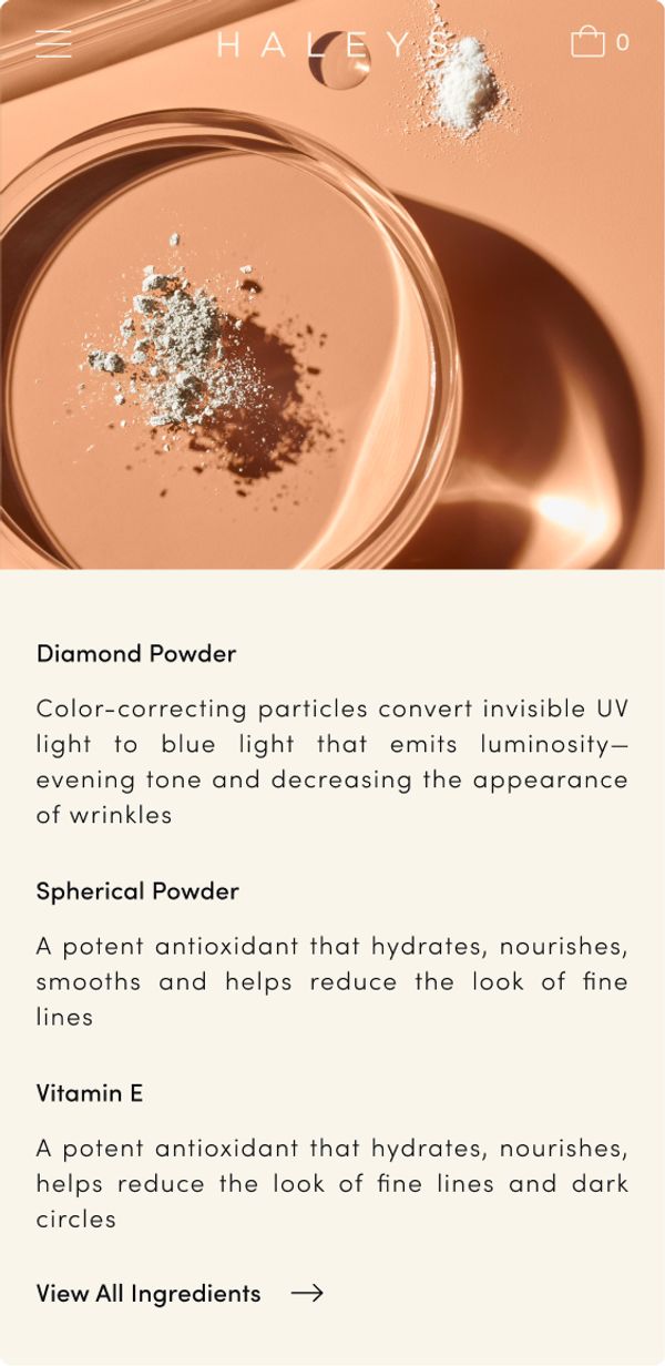
We also incorporated textbook-inspired icons and graphic elements, taking cues from Petri dishes and product design.

EFFORTLESS SHOPPING
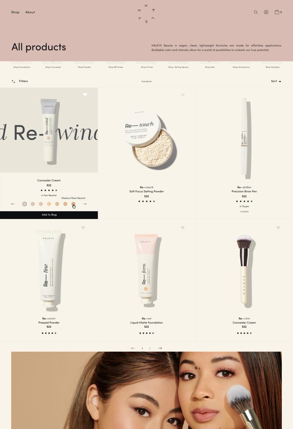
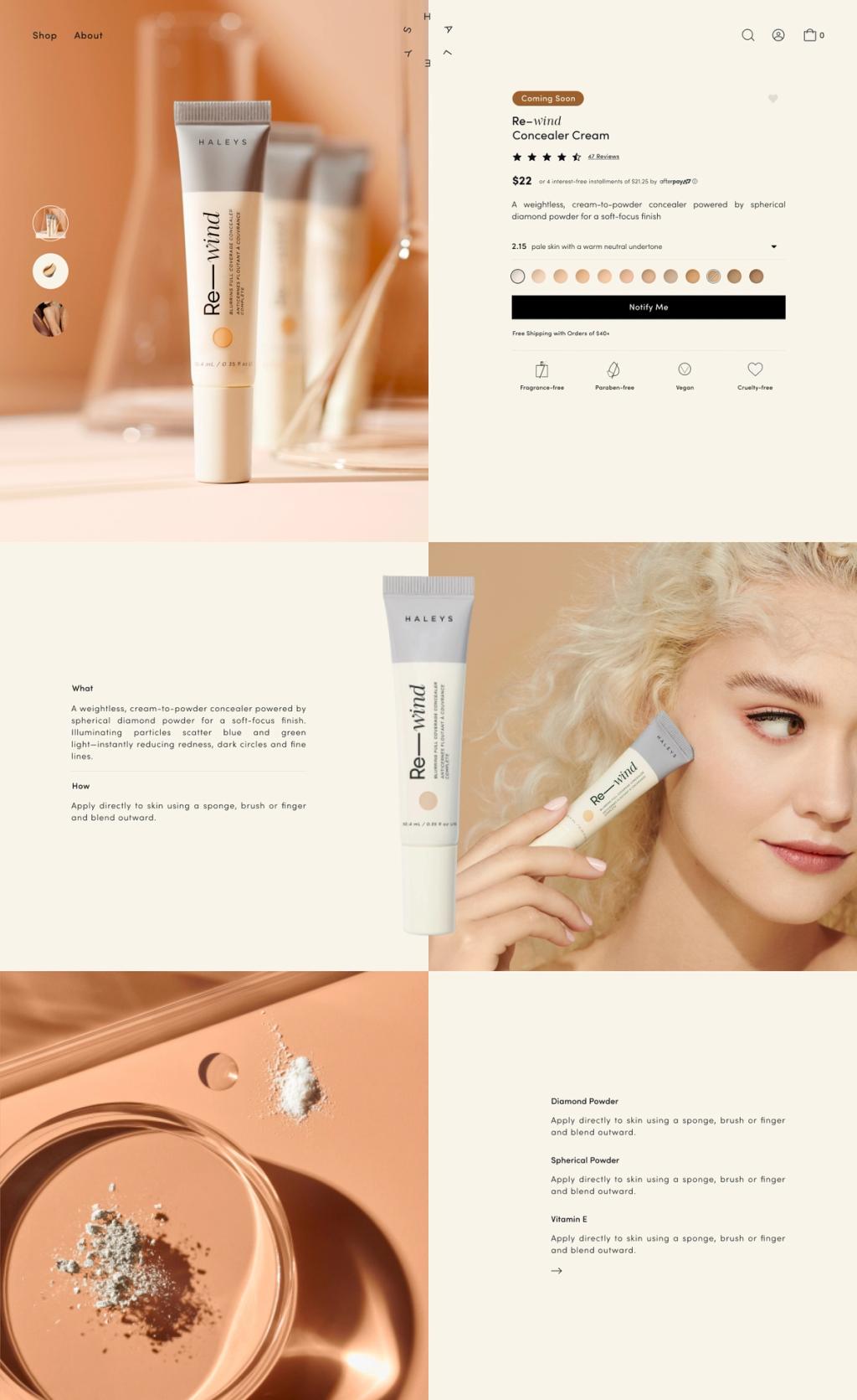
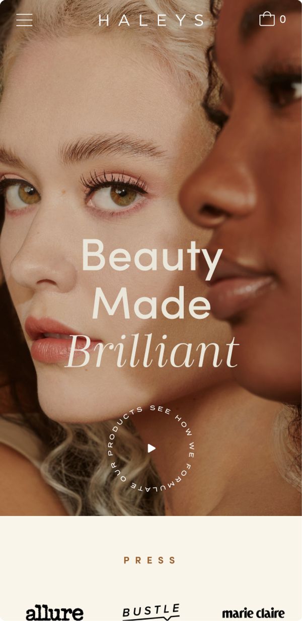
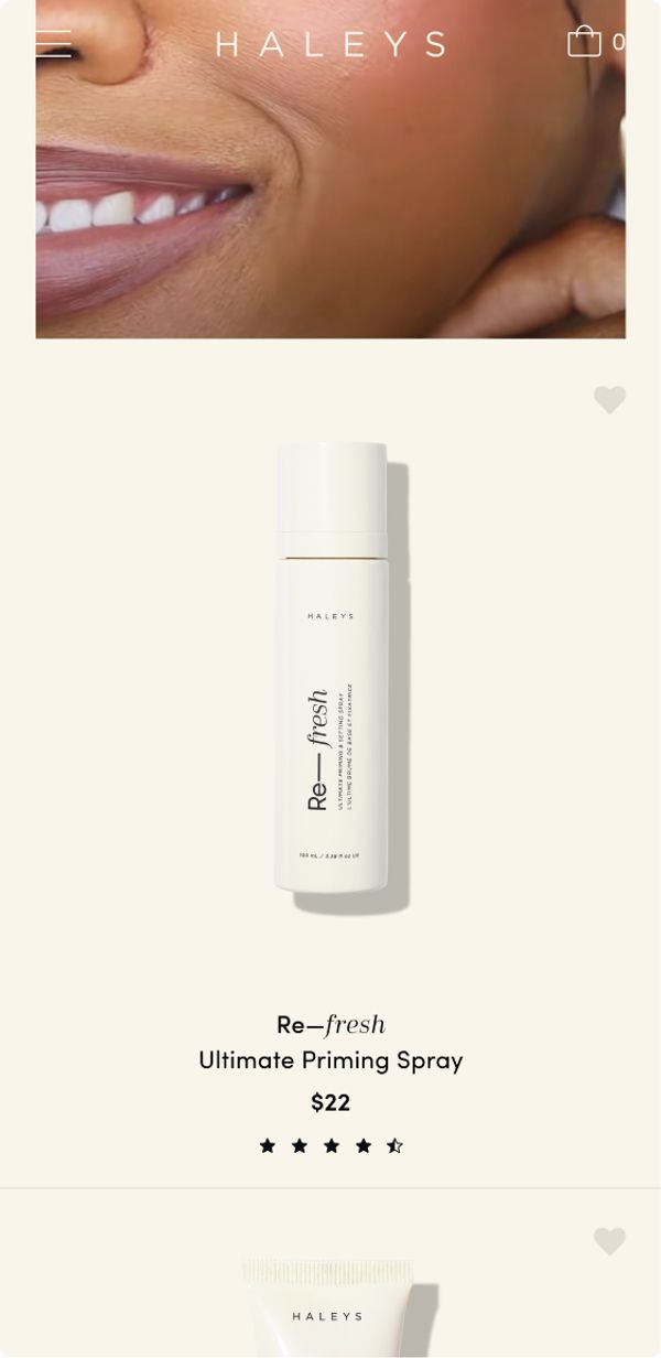
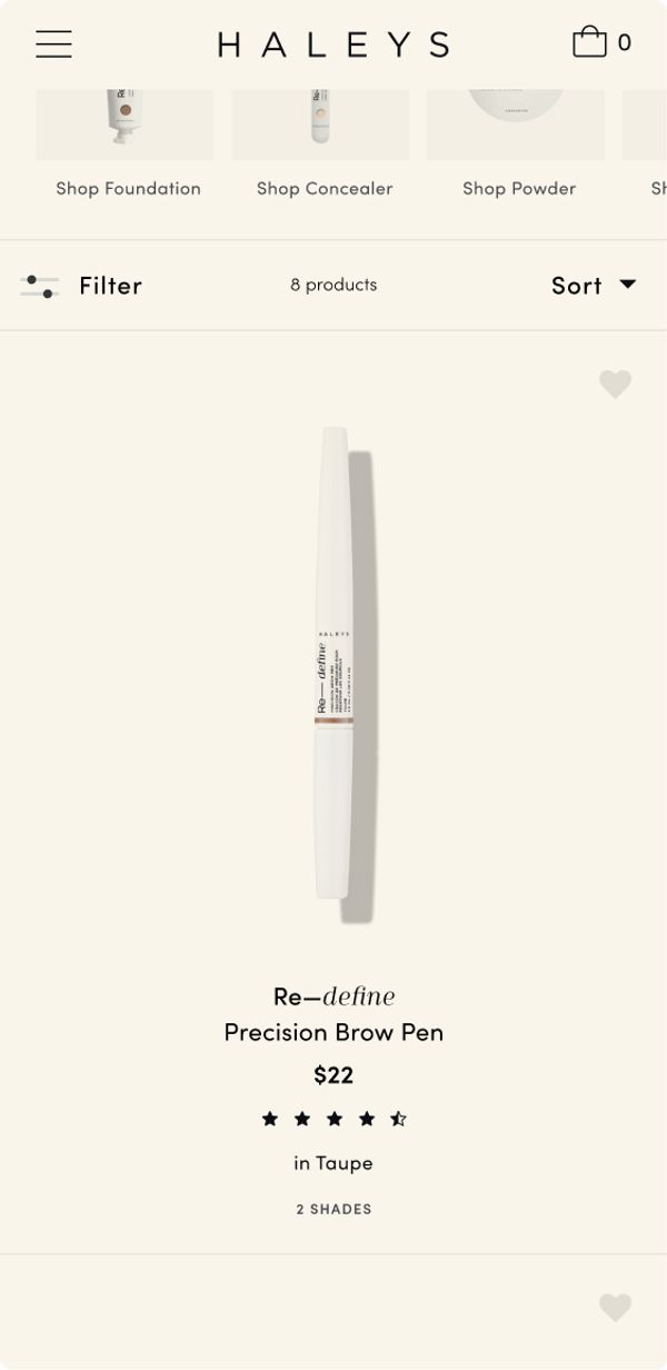
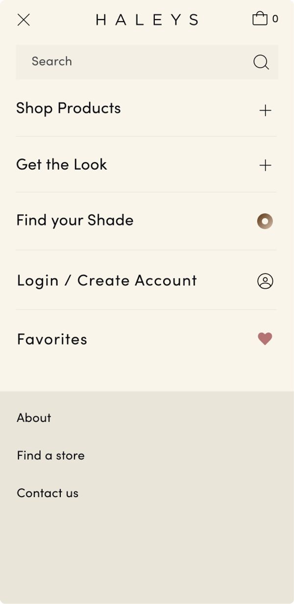
With over 75% of HALEYS traffic coming from mobile, we designed the UX to accommodate quick, simple, and intuitive shopping. Customers can easily view all product images, select available product variants, and add items to their cart: all while never leaving the product listing page. The product page designs are light and clean, giving the customer an easy shopping experience while still giving the product enough room to breathe.
