Herschel Embodies Beautiful Simplicity
Client
Herschel
Year
2021
Role
Strategy, UX, Design
Ask
Herschel needed to modernize their existing site design system to allow for a more effortless shopping experience and a better way to display their products.
Solution
We reworked their current architecture to allow for intuitive shopping, while implementing brand storytelling to pay homage to their brand identity.
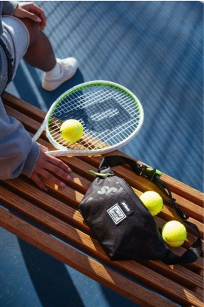
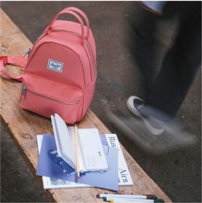
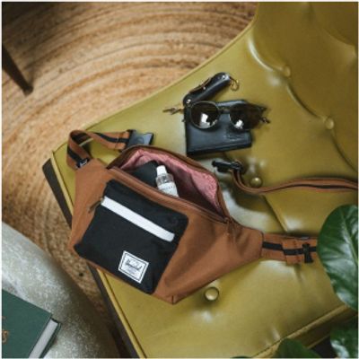
Herschel's product collections are timeless staples - they needed a site that could keep up. We took their existing brand structure and developed a design system that made shopping easier while opening up moments for brand and product storytelling. By designing this new architecture, we enabled the visual design system to work across all their products and offerings.
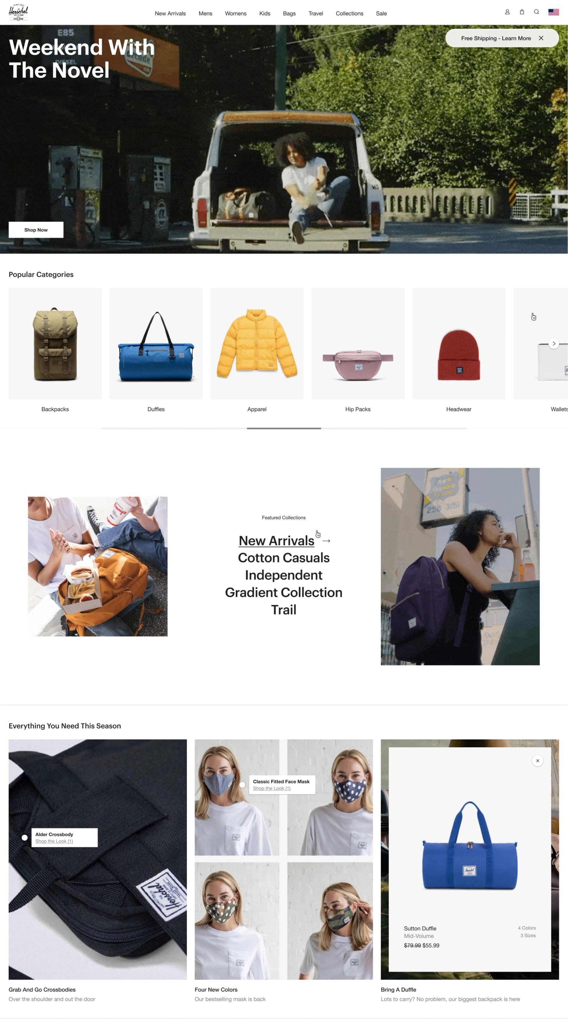
Contextualizing Product Throughout
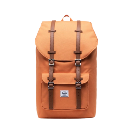
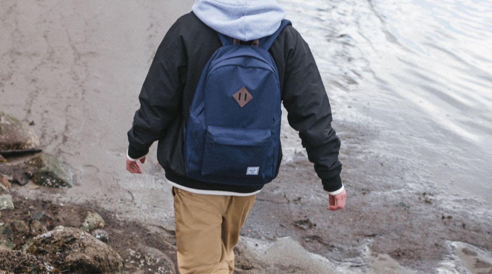
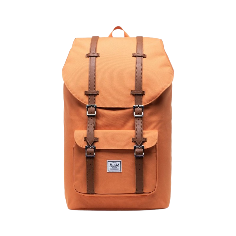
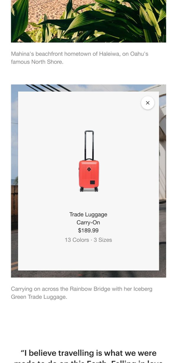
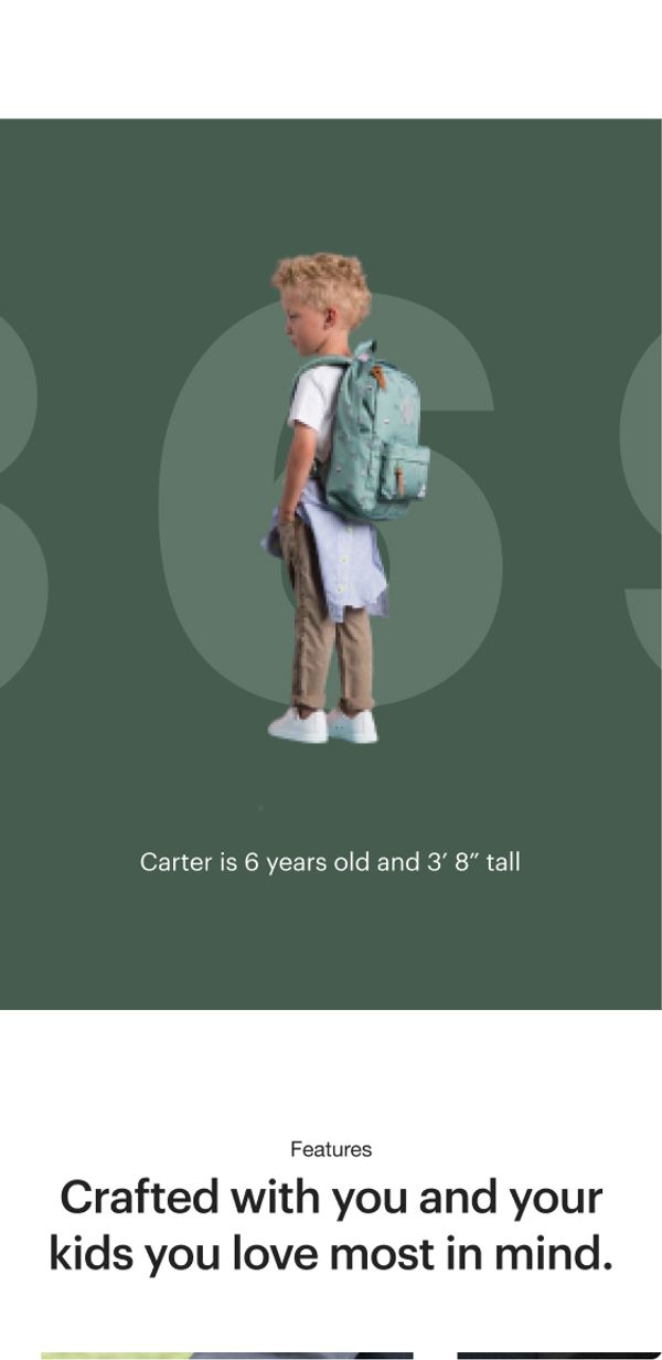
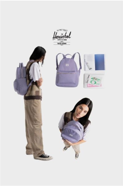
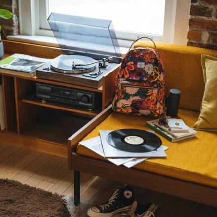
One of the primary complaints from the site experience was the lack of context around the size of Herschel’s most iconic product - the backpack. The lifestyle imagery was beautiful, but the product imagery lacked the context shoppers needed to make an informed buying decision.
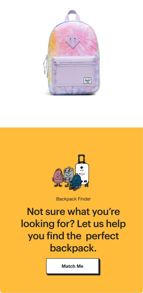
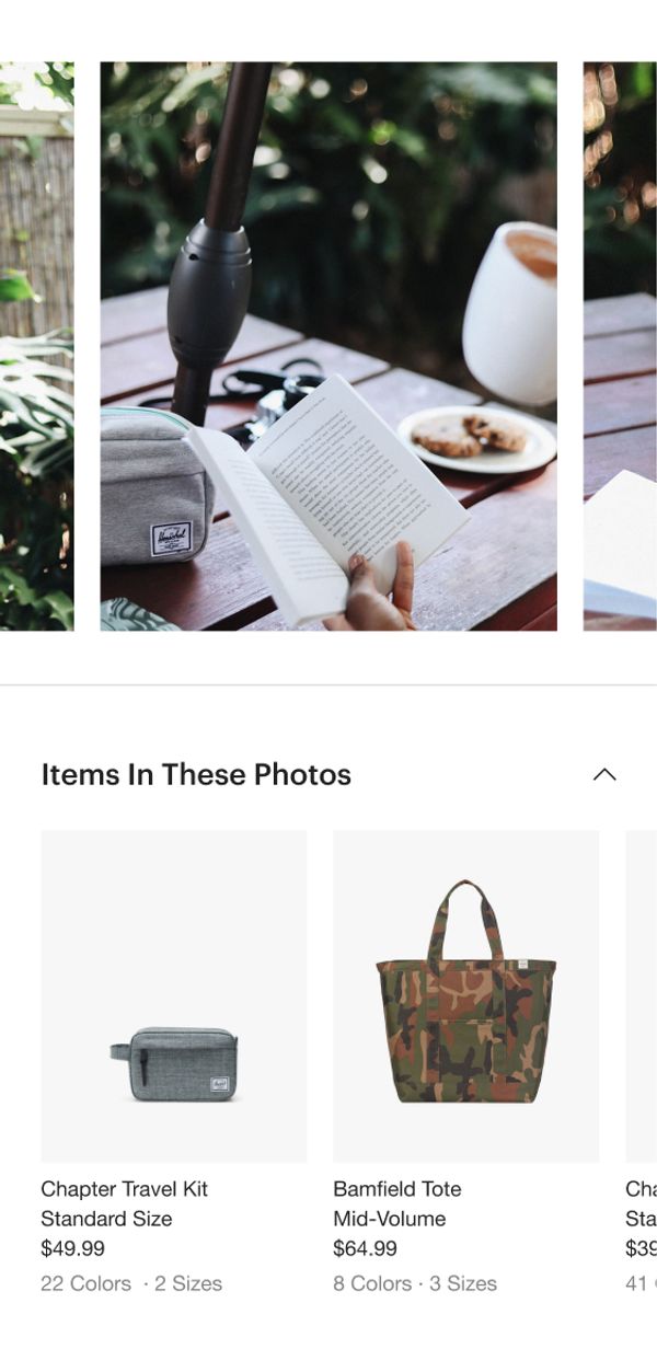
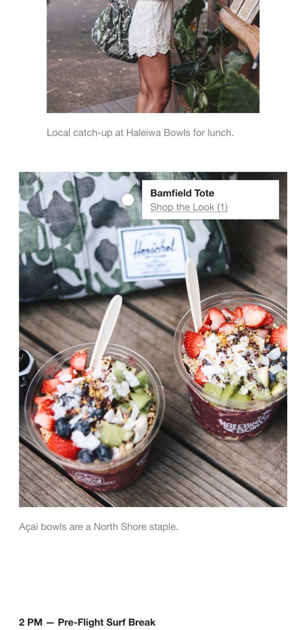
To tackle this issue, we created a design system that allowed their product assets to be contextualized across the experience with clever use of a combination of iconography, guided shopping, and on-model videos and photos - keeping the user educated throughout the entire journey to checkout.
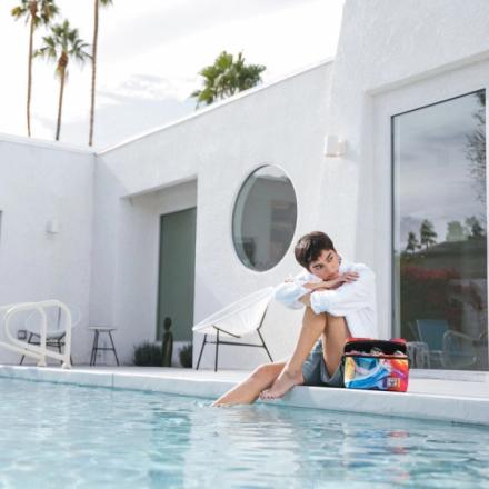
Restructuring the navigation and Product Listing Pages
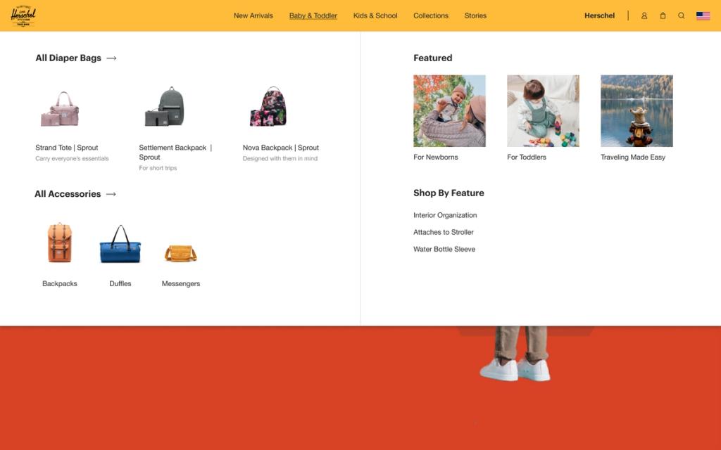
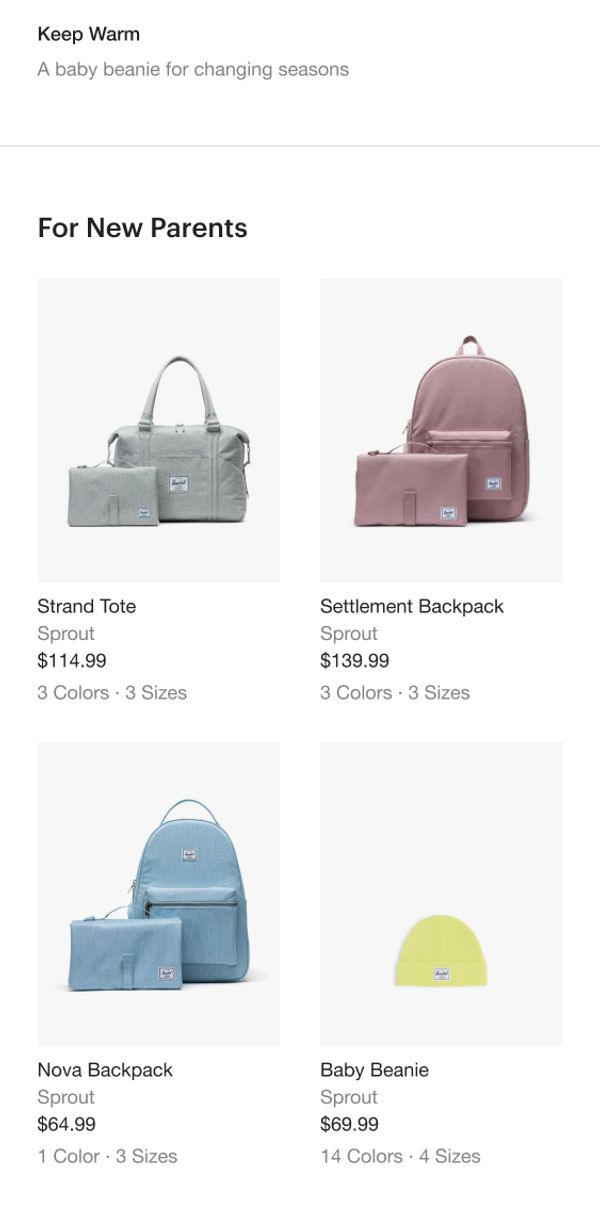
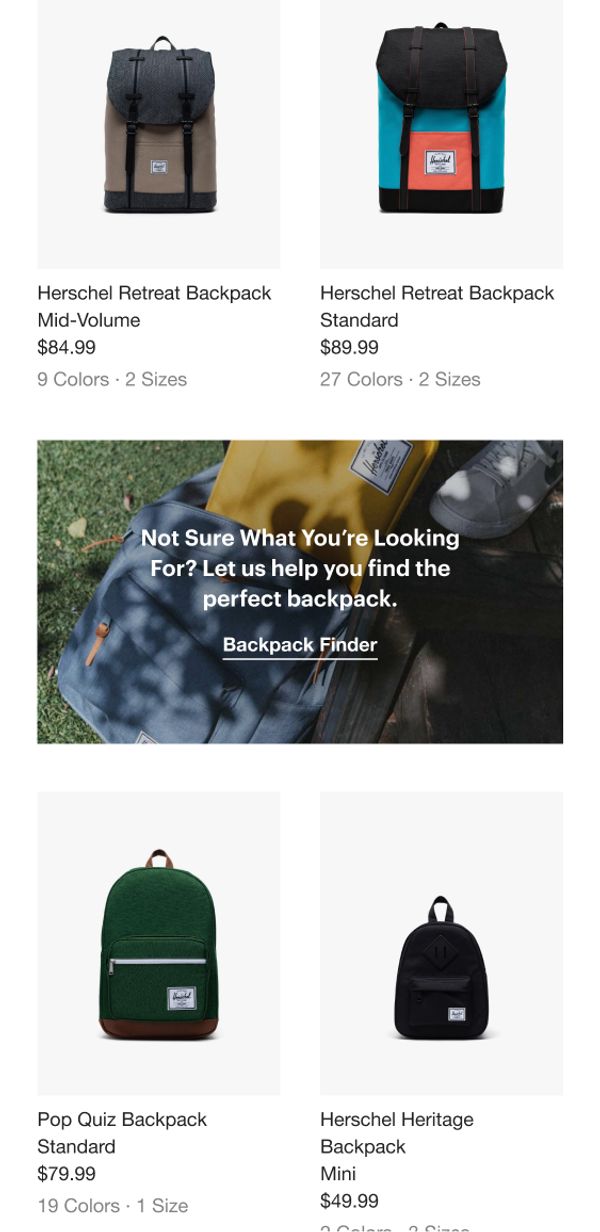
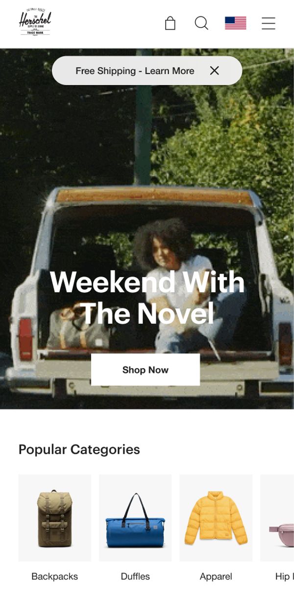
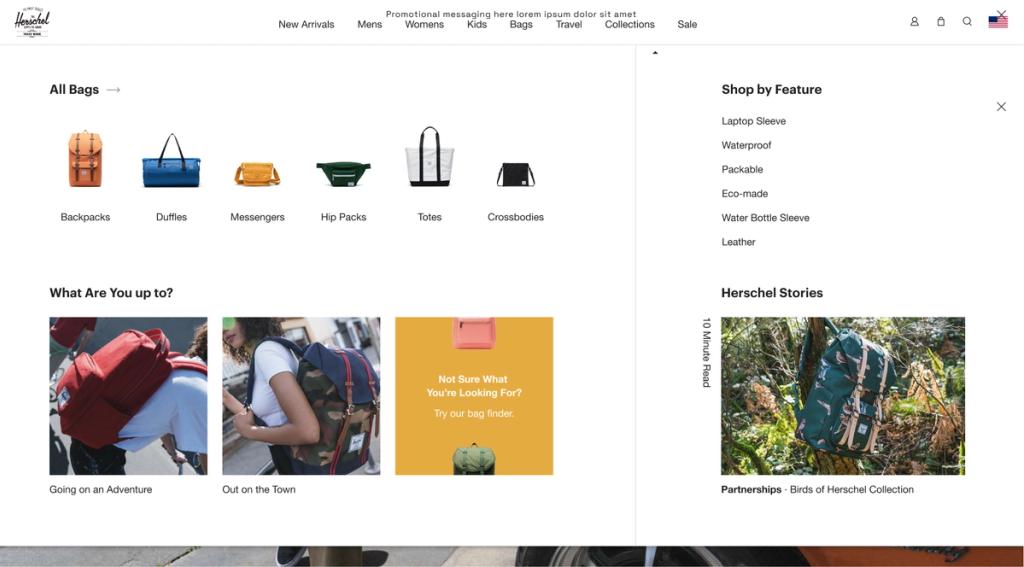
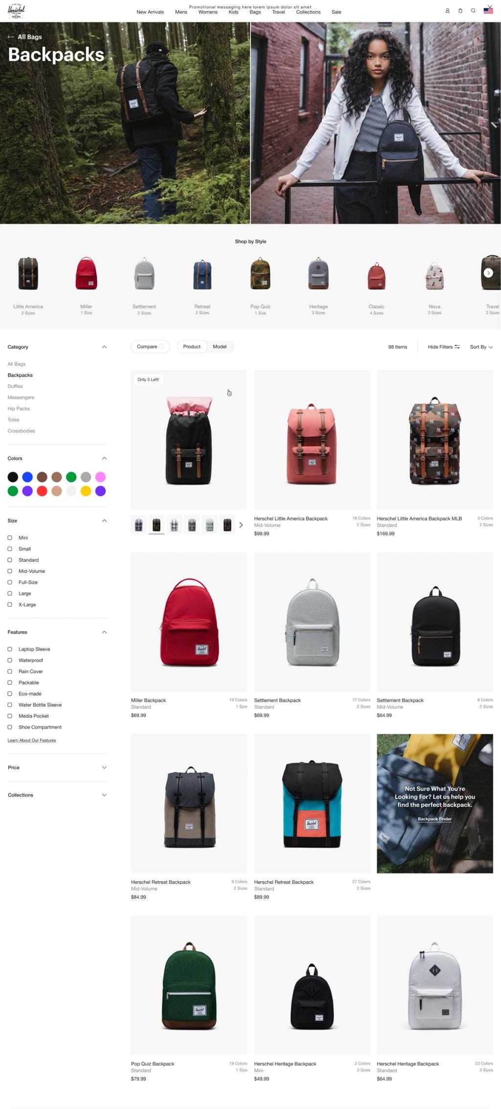
Herschel came to us with a challenge to design a user experience that was easily shoppable and still showcased their products and education. We implemented a visual navigation for an easy-to-use menu system that allows customers to quickly locate what they came for. We also reimagined their product listings and tile; what started as a simple redesign resulted in an overhaul of their product listing taxonomy structure.
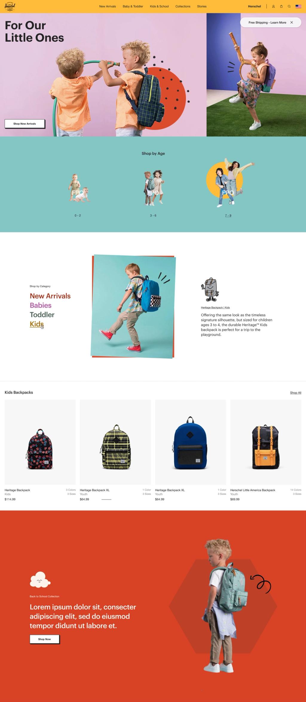
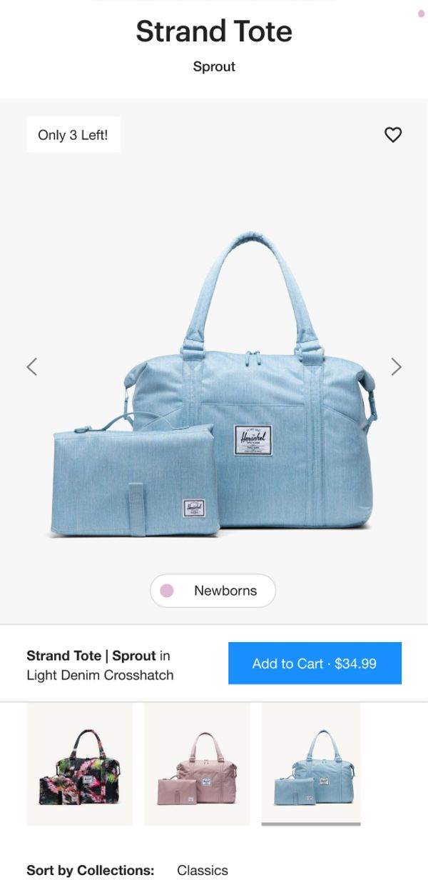
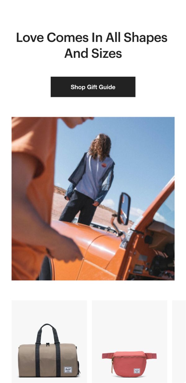
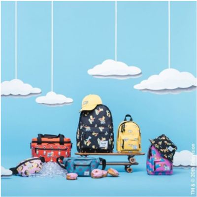
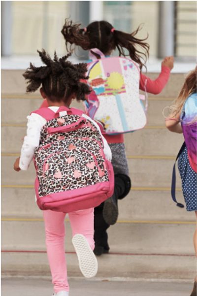
Herschel For the Little Ones
It's unfair that only adults can use these iconic bags and backpacks. That's why we teamed up with the Herschel team to create a digital brand language that promoted their Little Herschel products. We created a destination just for the kids through bright colors and energetic illustrations.
